Effect styles
Elevation, focus, and glass effects: the seven-step shadow scale, the composable keyboard focus rings, and the four backdrop-blur steps, all rendered live from the tokens in theme.css.
Shadows
7 stepsSeven elevation steps, each a box-shadow token of one to three translucent black layers: xs–sm for inputs and cards at rest, md–lg for dropdowns and popovers, xl–3xl for modals and marketing imagery. Translucent black is tuned for light surfaces: in dark mode the shadows recede and elevation is carried by surface color and borders, exactly as the kit's own components behave. The kit also ships shadow-xs-skeuomorphic, a code-side token with no Figma sheet; DrumKit zeroes it in theme.css, so every button is flat.
shadow-xs
shadow-sm
shadow-md
shadow-lg
shadow-xl
shadow-2xl
shadow-3xl
Focus rings
2 colorsSingle-layer focus rings for elements such as toggles and checkboxes that don't need a shadow. In code the ring is an outline: outline-focus-ring (brand-500) or outline-focus-ring-error (rose-500, the sheet's red-500) with outline-2 outline-offset-2. Always on in these cards, while components apply it through focus-visible so only keyboard users see it.
outline-focus-ring
brand-500
outline-focus-ring-error
rose-500
Tab to see the focus-visible ring
Focus rings with shadows
3 combinationsElements such as buttons need a focus ring and a shadow. Figma can't stack effect styles, so the sheet ships combined focus-ring-and-shadow styles; in code the outline and shadow are independent utilities that compose freely, exactly as these cards do.
focus-ring + shadow-xs
brand-500
shadow-xs
focus-ring + shadow-sm
brand-500
shadow-sm
focus-ring-error + shadow-xs
rose-500
shadow-xs
Backdrop blurs
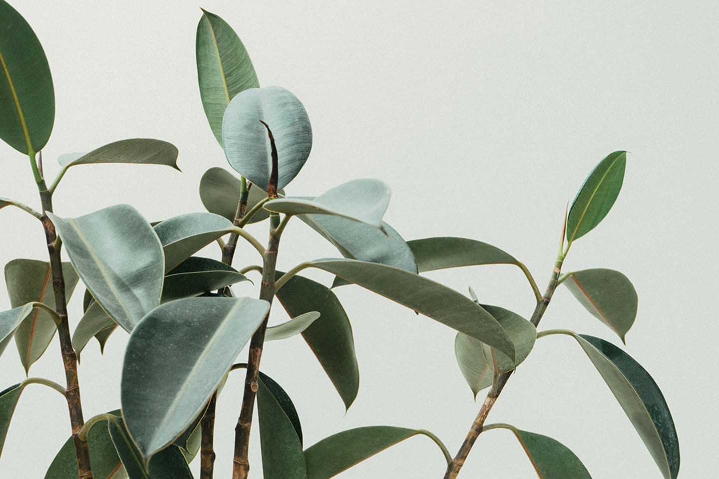
4 steps × 2 stylesFrosted-glass panels for navigation bars, overlays, and image cards, shown over a fixed photo in the sheet's light and dark glass styles. The sheet's four steps (sm, md, lg, xl) are the --blur-* tokens in theme.css, named exactly as the sheet names them: 2, 4, 6, and 10px, tuned to draw what the sheet draws. Figma blur renders at half the strength of the CSS blur() sigma: divide a Figma blur value by two when translating a design.
backdrop-blur-sm
light
backdrop-blur-sm
dark
backdrop-blur-md
light
backdrop-blur-md
dark
backdrop-blur-lg
light
backdrop-blur-lg
dark
backdrop-blur-xl
light
backdrop-blur-xl
dark