Video players

Video players embed self-hosted clips behind DrumKit’s own hover-revealed control chrome, replacing the browser’s default controls with on-brand play, volume, seeking, speed, and fullscreen.
Demo

Change the props and copy the result. The cover picker maps to the real thumbnail props, and every other control is a real prop. Switching size also resizes the preview frame to the footprint the sheet drew that chrome for (320, 560, 720): the size prop itself only scales the bar and picks its controls, so the frame is the demo’s container rather than part of the snippet.

Big Buck Bunny, 20 second clip
0:00
-0:00
size
cover
import { VideoPlayer } from "@/components/base/video-player/video-player"; <VideoPlayer size="lg" thumbnailUrl="/media/big-buck-bunny-poster.jpg" thumbnailAlt="Big Buck Bunny, 20 second clip" src="https://lorem.video/720p" className="aspect-video w-full overflow-hidden rounded-xl" />

The sample streams, and it is not muted

Every player on this page streams the same public sample clip and opens on its cover, so an offline preview shows the poster with a dead play button. Sound starts at full volume on first play: press M or the mute button before scrubbing in a quiet room. Hover the frame, or Tab to it, to reveal the control bar.

The family

One directory: the player itself, a standalone blurred play badge for building your own covers, and the filled glyphs behind both. The player’s own cover badge is built inline rather than from that export, and is 16px smaller.

The components in this family, with their descriptions and import paths
ComponentDescriptionImport from
VideoPlayerThe player: a native video element behind a hover-revealed control bar, sized sm, md, or lg.@/​components/​base/​video-player/​video-player
PlayButtonIconA standalone 80px blurred play badge for custom covers and linked posters. The player does not use it: its own cover badge is built inline at 64px, so the two are similar but separate.@/​components/​base/​video-player/​play-button-icon
PlayIcon / PauseIcon / AirplayIconThe filled SVG glyphs behind the control bar and the badge; they take plain SVG props. AirplayIcon is DrumKit-authored — the sheet draws a filled triangle, and the line-only icon set does not carry one.@/​components/​base/​video-player/​icons

Sizes

The 3 sizes decide which controls render, not how big the video is: sm keeps play, mute, and fullscreen; md adds the timestamps, the seekable progress bar, and the trick-play readout; lg adds the volume slider, the playback speed control, and the Stream button, which appears only when a remote receiver is on the network. Each frame below sits at the width its Figma counterpart was drawn at (320, 560, 720); the geometry itself always comes from className.

Big Buck Bunny, 20 second clip
sm
Big Buck Bunny, 20 second clip
0:00
-0:00
md
Big Buck Bunny, 20 second clip
0:00
-0:00
lg

size is chrome, className is geometry

The size prop scales the bar and picks its controls; the frame’s width, aspect, and corner radius are yours to set with className. The video and the cover inherit the radius through rounded-[inherit].

The cover

An optional thumbnail hides the video until first play: the image, the blurred play badge, and an optional scrim. Play dismisses it, and the end of the clip brings it back. The badge circle is suppressed at sm, where the bare glyph renders alone.

0:00
-0:00
none
Big Buck Bunny, 20 second clip
0:00
-0:00
thumbnail
Big Buck Bunny, 20 second clip
0:00
-0:00
thumbnail + overlay

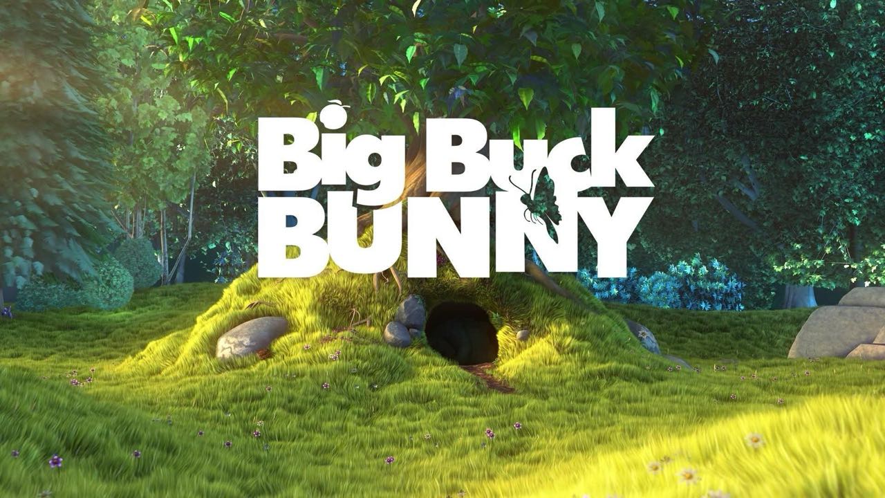
This cover is the clip’s own title card

The poster is served from this app rather than a second remote host, and it is what a real cover should be: artwork from the video itself, sized to the video’s own 1280×720, with a thumbnailAltdescribing what plays rather than what the picture shows.

States

The player’s states are live rather than forced: the kit exposes no state props and writes its treatments inline against real hover and focus, so there is no honest way to pin them statically. The first frame has no cover, so its center play badge stands while paused; hover to reveal the bar, Tab to it for the focus ring plus the bar, and press play to watch the badge step aside. Let the second clip end to watch its cover return.

0:00
-0:00
rest: the center badge stands; hover or focus reveals the bar
Big Buck Bunny, 20 second clip
0:00
-0:00
covered: paused behind its thumbnail

No disabled, no loading, no error state

The family has none of the three: no prop disables the player, and a stalled or failed stream shows the black surface with no spinner or message. If a surface needs those states, they are yours to build around the player.